Project 08 / Client work
Serenity Cooling Mist
- Client
- Purely Bella
- Category
- Campaigns
- Year
- 2026
- Services
- 3D Product / Art Direction / Campaign Visuals
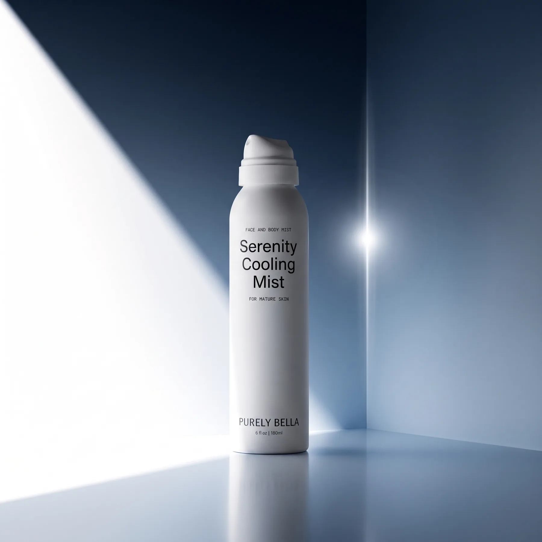
The Serenity Cooling Mist is the loudest product in an otherwise quiet line: a tall aerosol can that needs to read as refreshment rather than skincare. The image had to feel colder than the rest of the system without leaving it.
The challenge
A white can on a white set has nowhere to go. The product needed contrast and drama, but the brand's restraint meant no props, no water, no color on the packaging itself.
Creative direction
Put the color in the room instead of on the product. A deep blue corner set, one hard shaft of daylight across the left wall and a flare pinned to the corner seam, so the can reads as the only white object in a cold room.
Process
- 01Can and actuator modeled from the packaging artwork
- 02Corner set built so the light shaft lands as a clean diagonal
- 03Flare and bloom passes tuned on the seam, not the product
- 04Floor reflection kept soft so the can stays the sharpest edge
Where it lives
- PDP hero for the mist
- Campaign key visual
- Vertical crops for social
Result
A cold, high-contrast image that gives the mist its own temperature while staying inside the line's monochrome world.